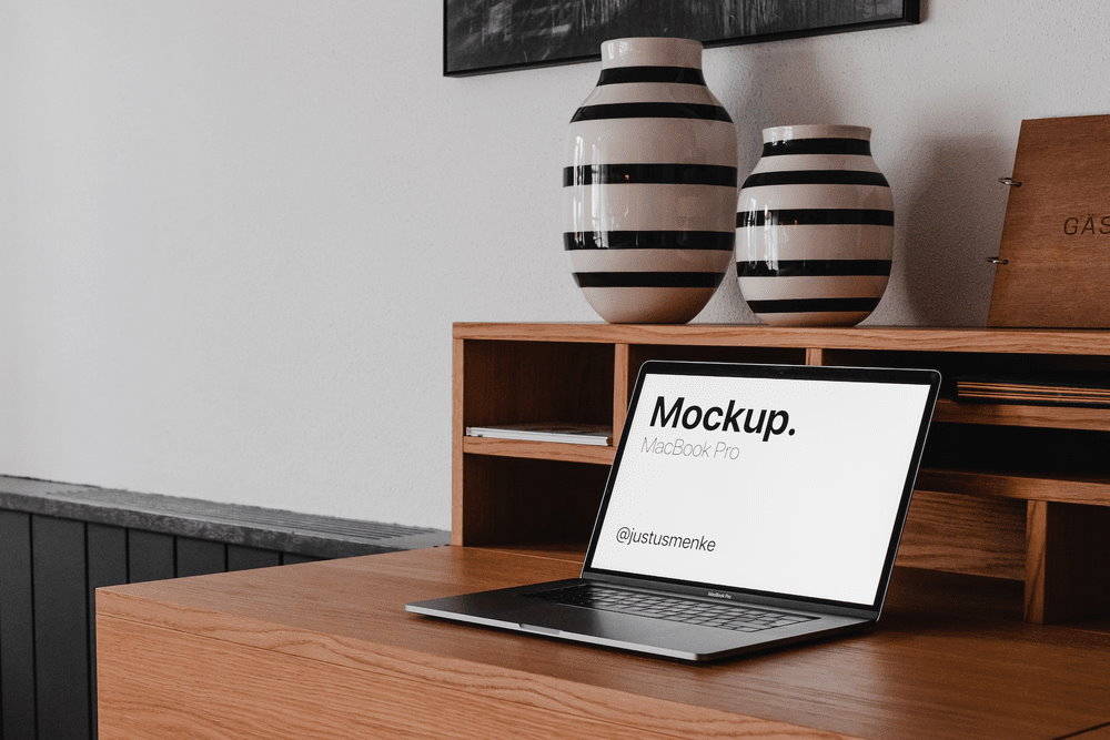
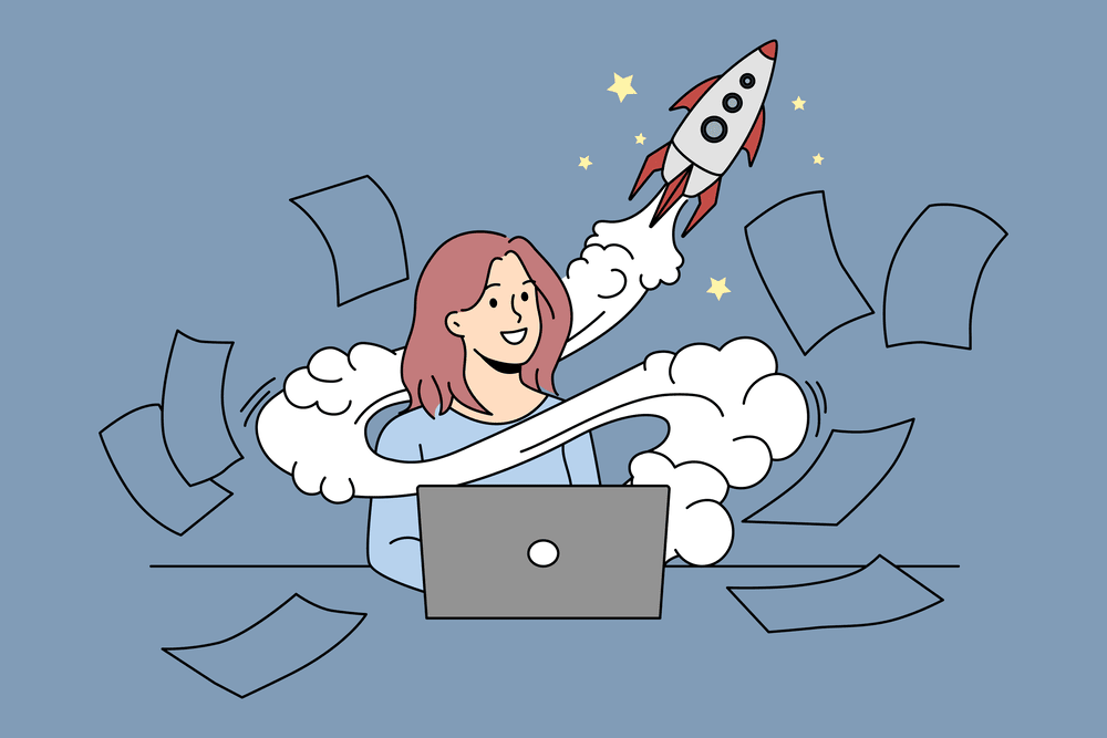
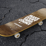
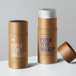
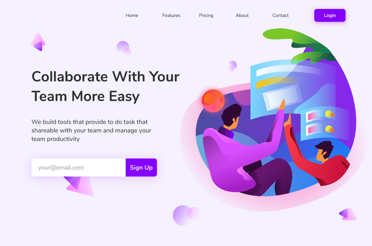
One of the best places to look for inspiration is in the work of other graphic designers. Looking at their work can give you fresh ideas on how to combine your new concepts with which you can infuse your art. Here are graphic design examples to get the juices flowing and get your next project started.
You may also like:
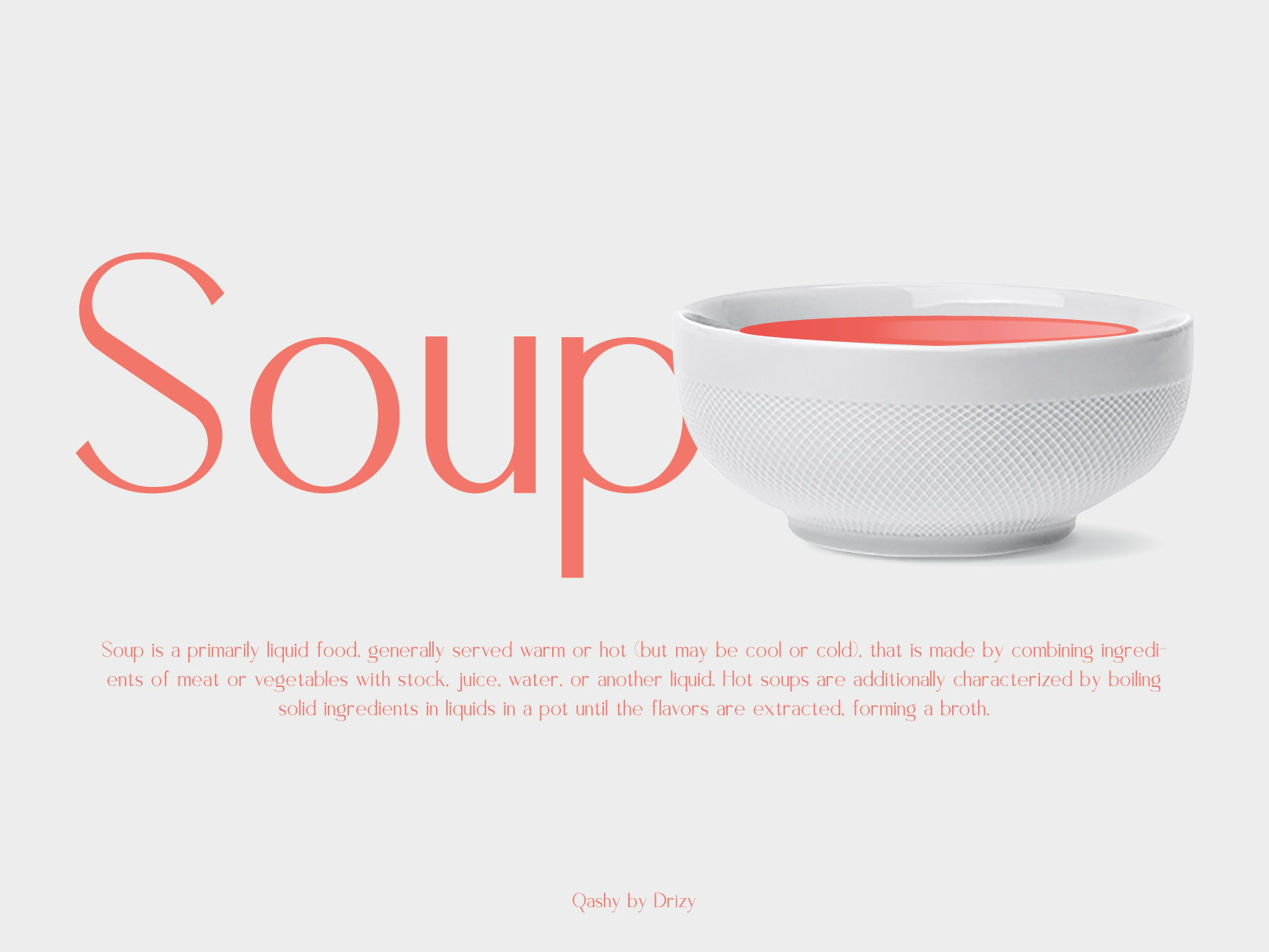
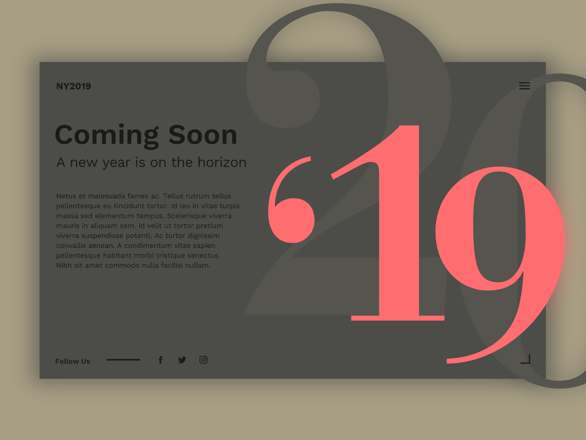
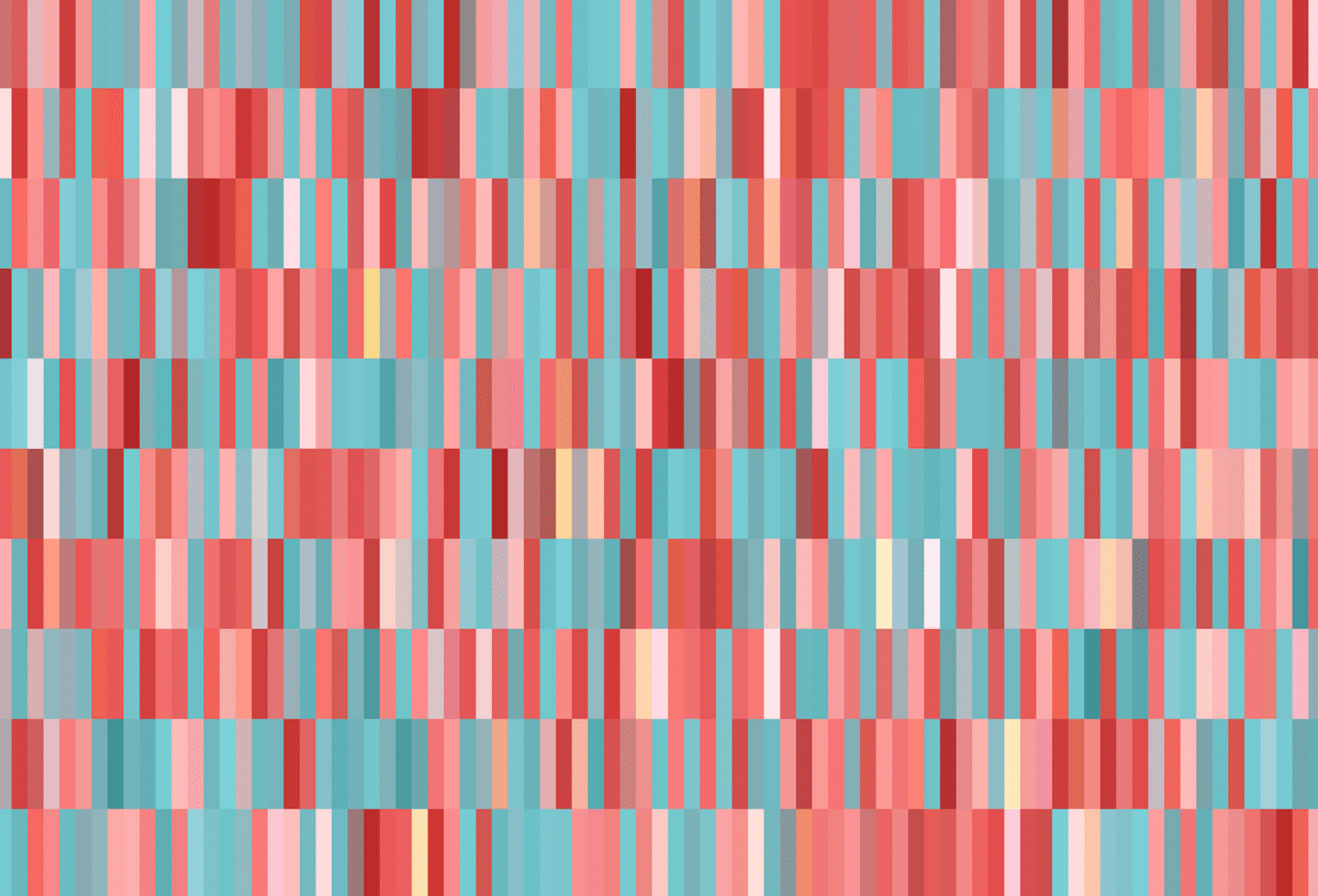
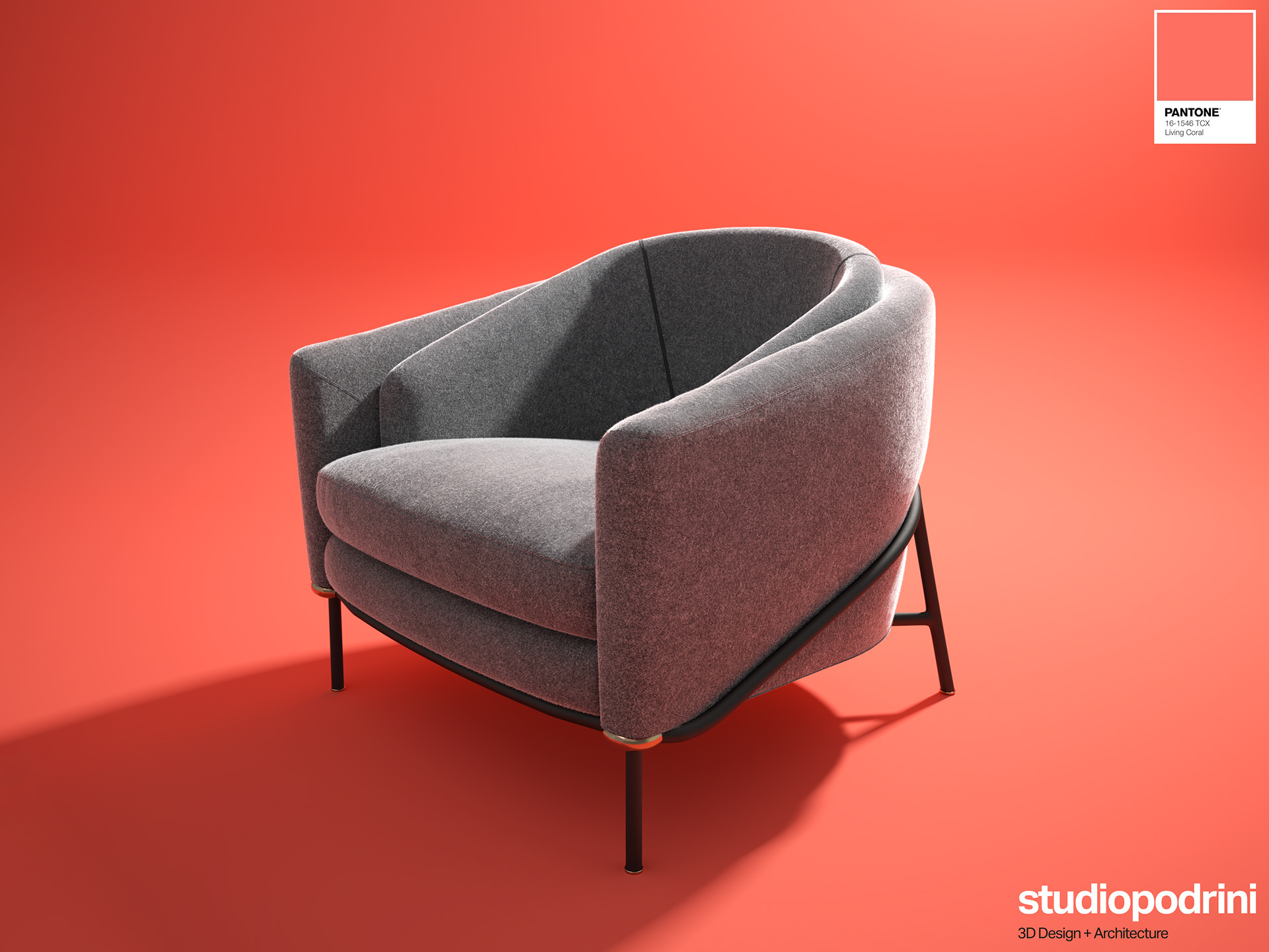
As we already know the Pantone color of the 2019 is a “Living Coral” – representative of many of the color trends we’ve seen heading into 2019. Bright hues are a popular choice and this color is certainly a bright option. So, keep in trends with your graphic designs.
About Living Coral
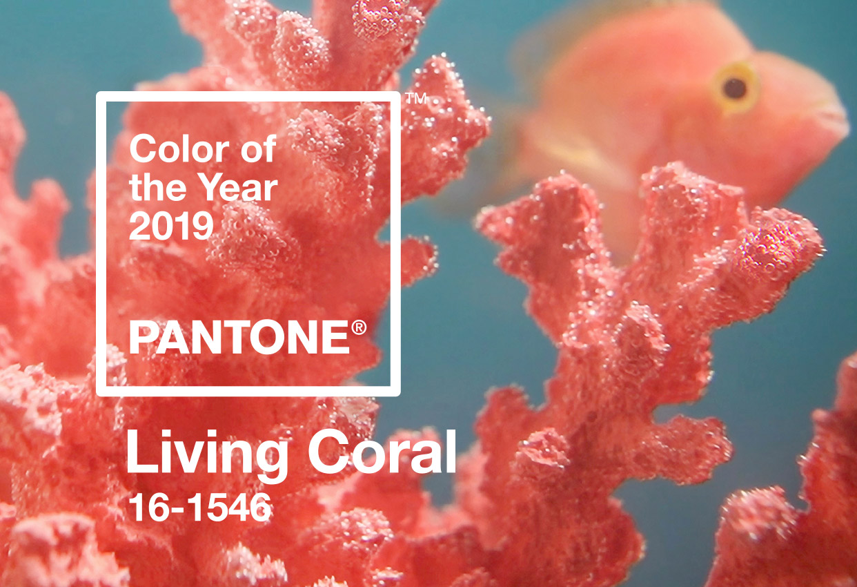
What’s nice about the selection is that it tends to fall in line with many current color trends and will blend well in gradients, as a bright background (that’s something other than blue) or as an accent color. While it has a somewhat feminine feel, this color can be a rather versatile option that’s just a bit softer than red or orange, but more vibrant than pink.
Here’s what Leatrice Eiseman, executive director of the Pantone Color Institute, has to say about the color selection:
“Color is an equalizing lends through which we experience our natural and digital realities and this is particularly true for Living Coral. With consumers craving human interaction and social connection, the humanizing and heartening qualities displayed by the convivial Pantone Living Coral his a responsive chord.”
In essence, the color is a simple, visual representation of the state of our design and marketing universe. Everything Eiseman says echoes that fact.
Color Swatches
- Pantone: 16-1546
- RGB: 255-109-112
- CMYK: 0-59-50-0
- HEX: ff6d70
Pantone made Adobe files available for download using Living Coral.
Living Coral Color in Design
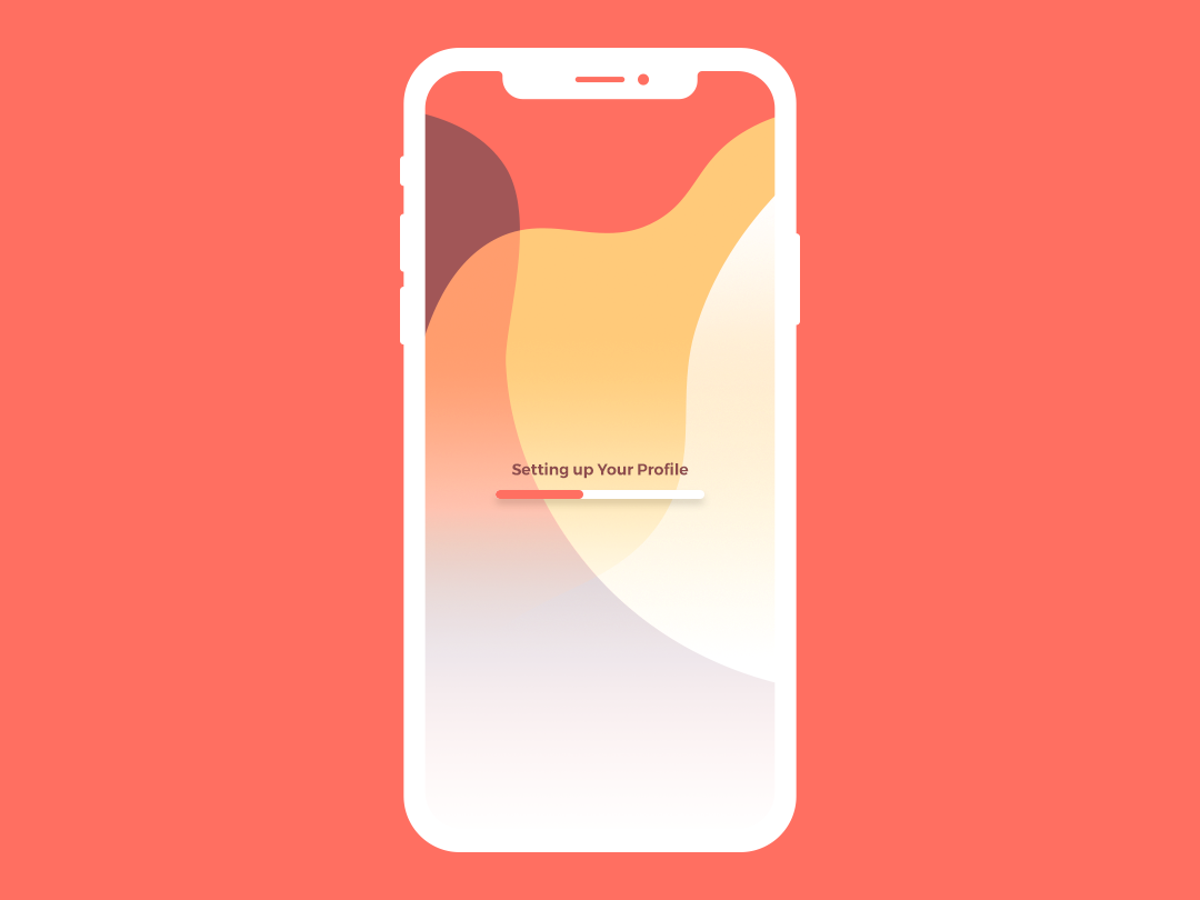
As a graphic designer we have no doubts, that in your online portfolio is more attractive colors that can be used in design projects, so stay creative and try to add something wild with something cute and your design will be observed.
Ideas are all around us and some of the most famous graphic designers tell us that inspiration is an act of intentional searching.
1. Using Gradients in Graphic Design
The latest scream by the graphic designers is using gradients in all kind of projects. It is one of the most popular topic and will be trending for long time. Let’s look to some great examples how gradients are used by different designers.
Seto Febriant
Vadim
Viktor Sherepa

Bruno Pego
Mihai Dolganiuc
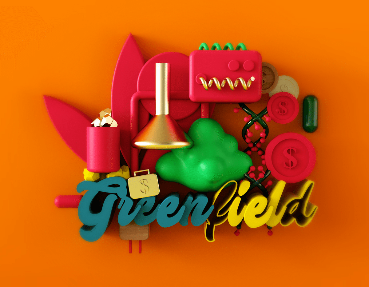
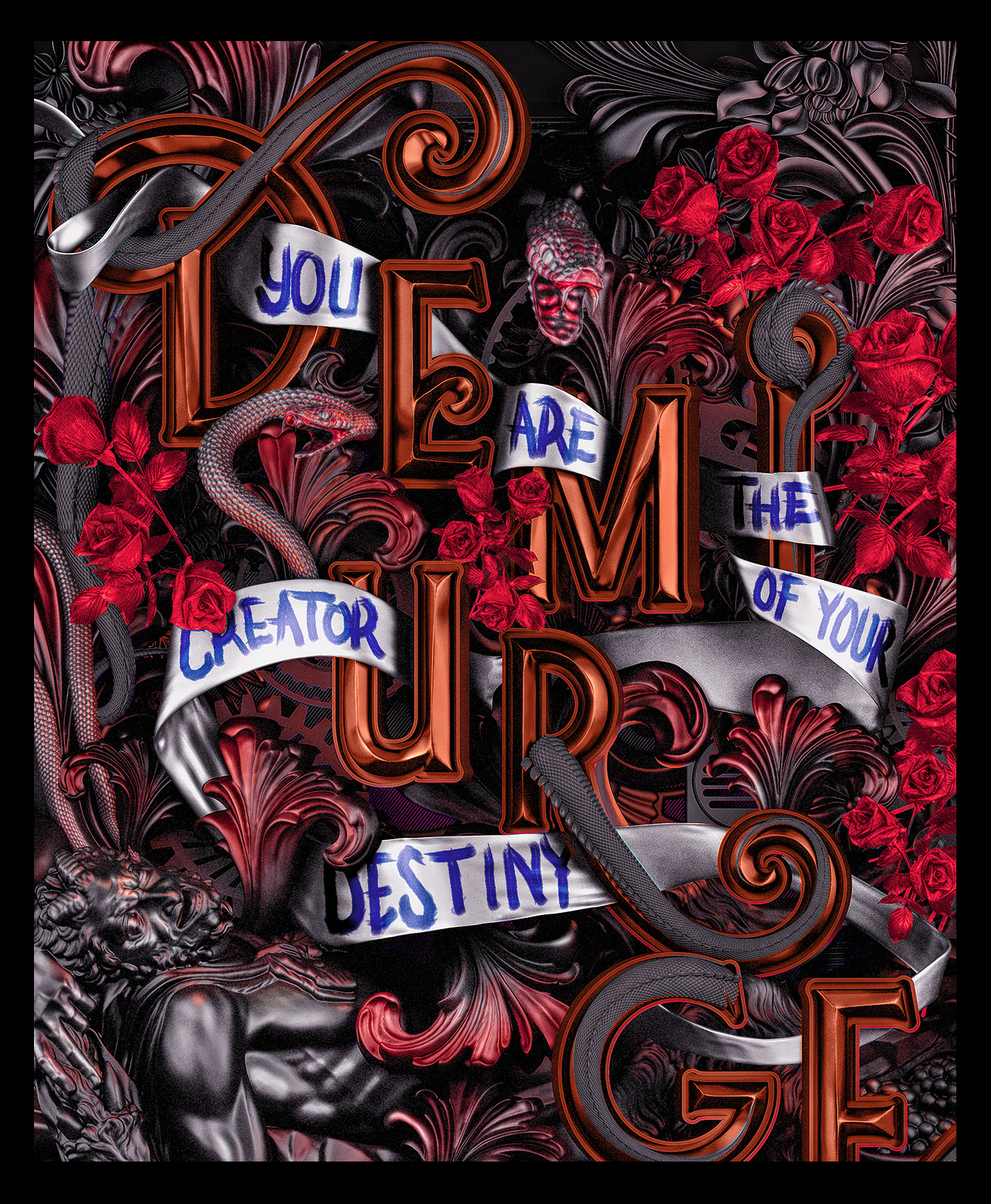
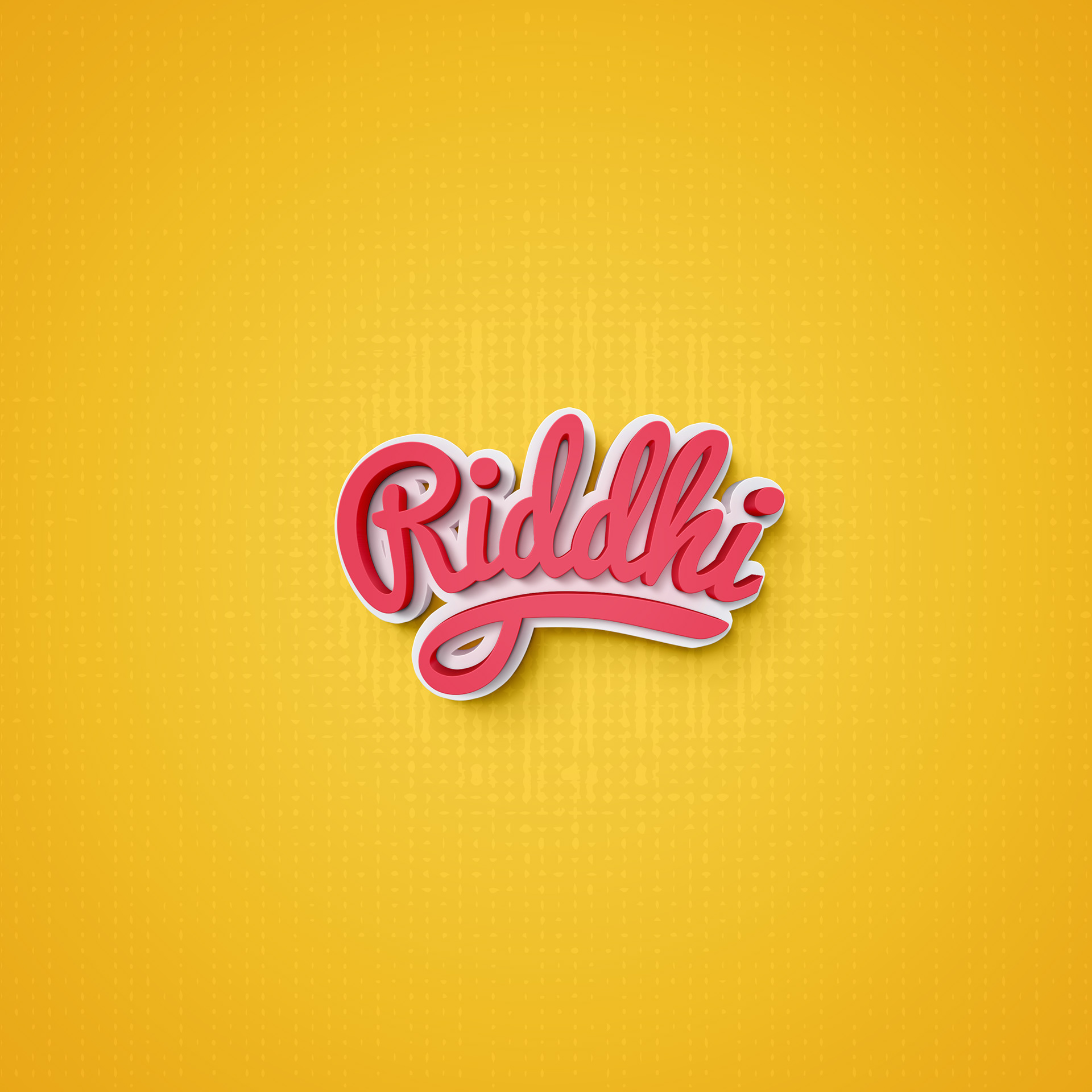
2. 3D Design and Typography
Three dimensional works seems to be everywhere right now: entire compositions that have so much depth, you can’t help but reach out and touch them. 3D typography especially feels just about ready to pop. The best part about it is there’s no particular type that works best for this trend: bold, skinny, sans-serif, script, any font can be rendered in 3D.
EFL
Katt Phatt
Rico Kurniawan

Kat Phatt
Riddhi Dhanani
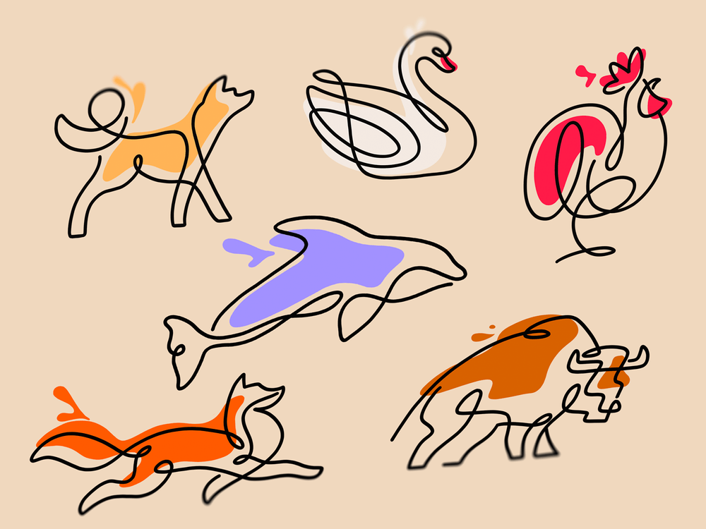
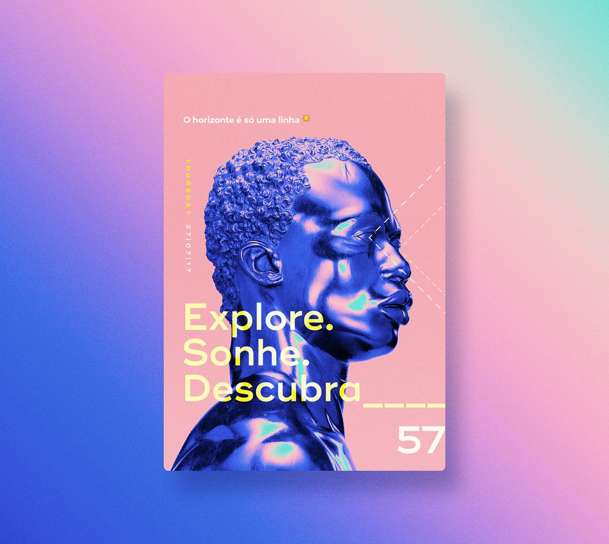
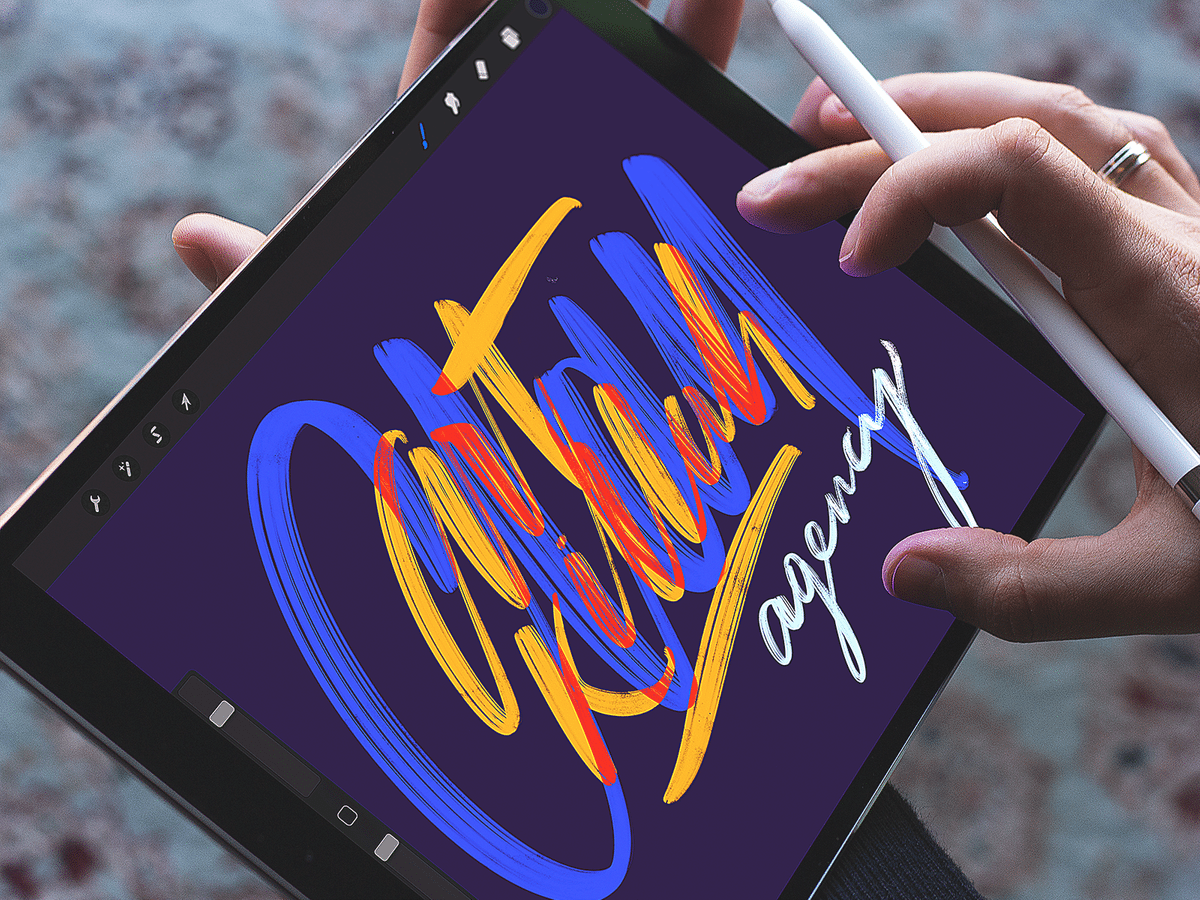
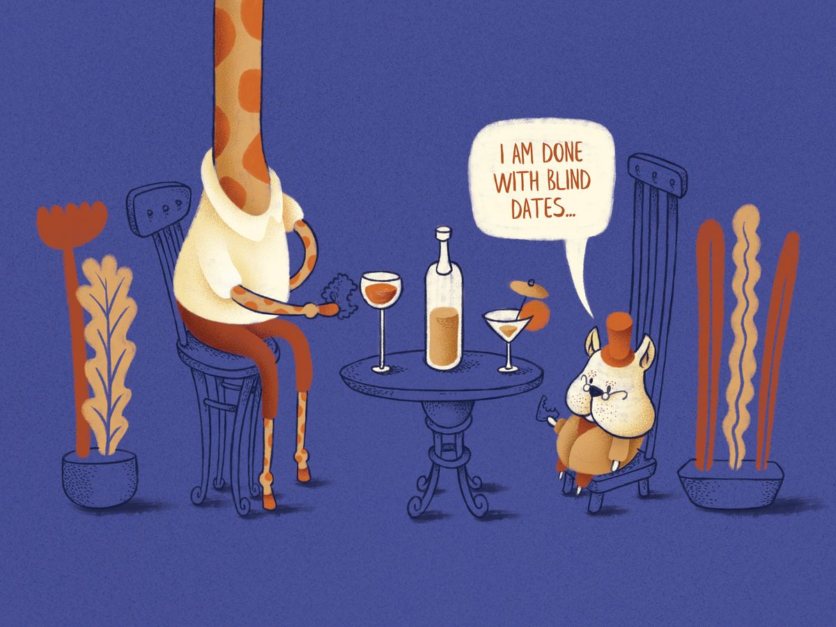
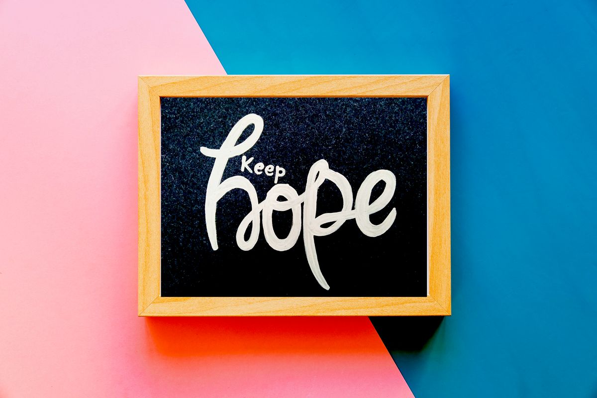
3. Digitization of Handwork
Modern tools for working with graphics objects are so advanced that they allowed moving the usual brushes in Photoshop to the background. Their time has already ended. Drawings by hand are now beautifully transferred to the digital space and complemented by unique effects.
Vidhi Mendhe
Tubik
David Sabon
Durriya Contractor
Natalia Mlodetski
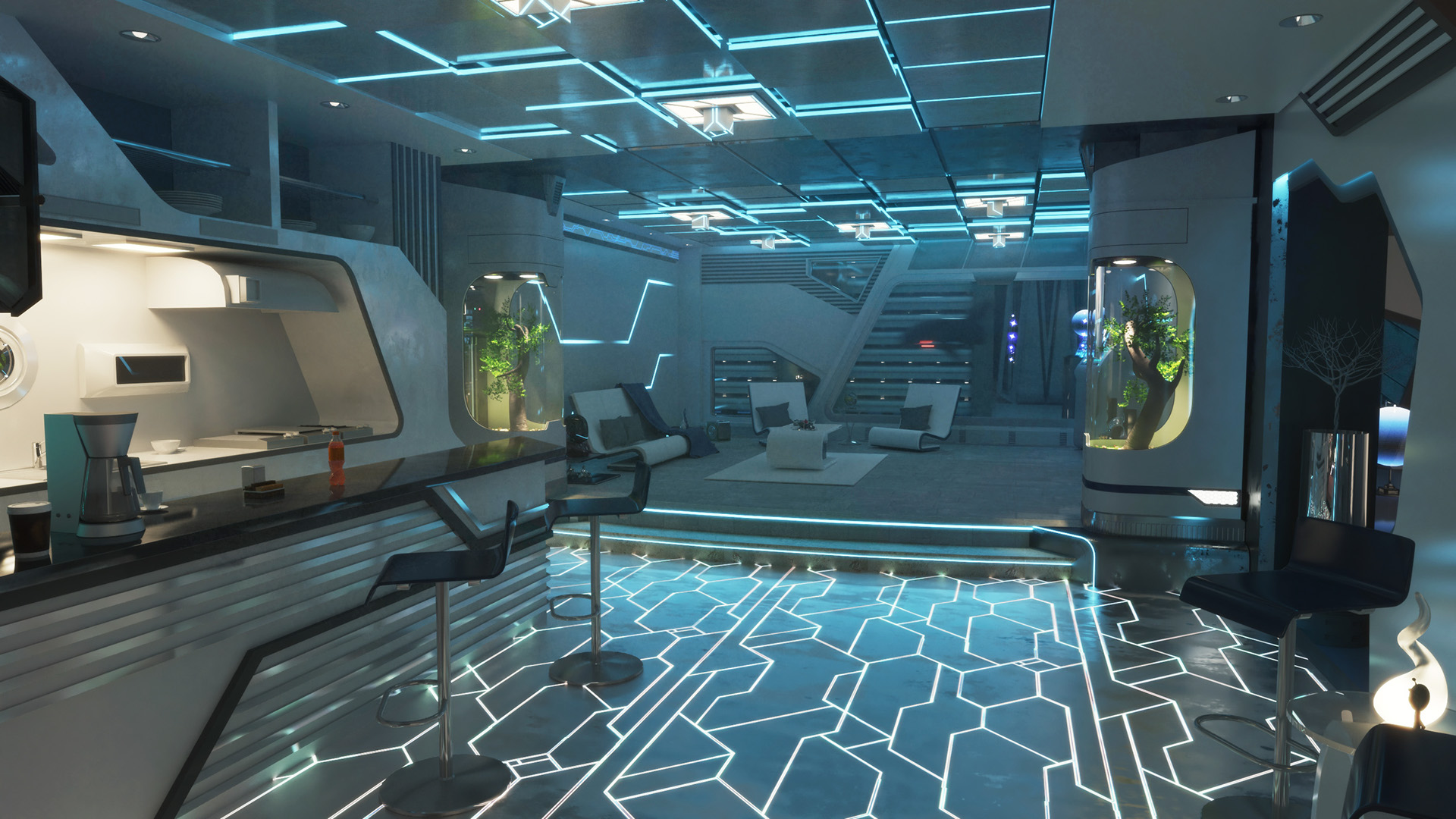
4. Futuristic Influences Are Mainstreem
I guess since we are technically living in the future that so many 80’s films predicted, it’s time for our designs to reflect that. This means a lot of futuristic patterns, colors and ideas are about to dominate the design world for the next few years.
We do have most of the futuristic devices they predicted in our pocket each day. So you might as well take advantage of that tech with your design work! I believe that this approach will help brands create unique content that will stand above the noise on social media.
Brands by Mozi
Anatolli Babii
Paulina Hanzel
Oleg Levin
Mohamed Alaa
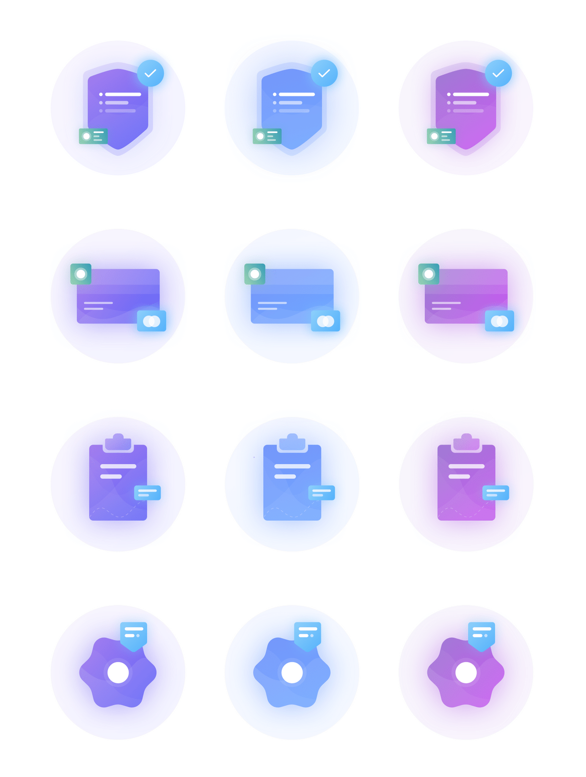
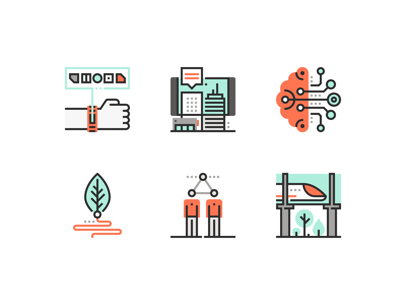
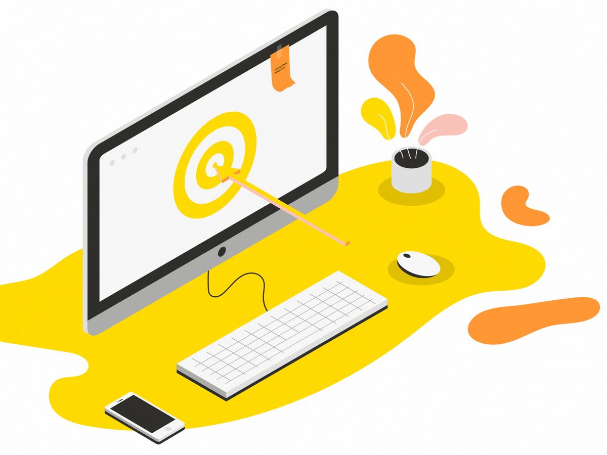
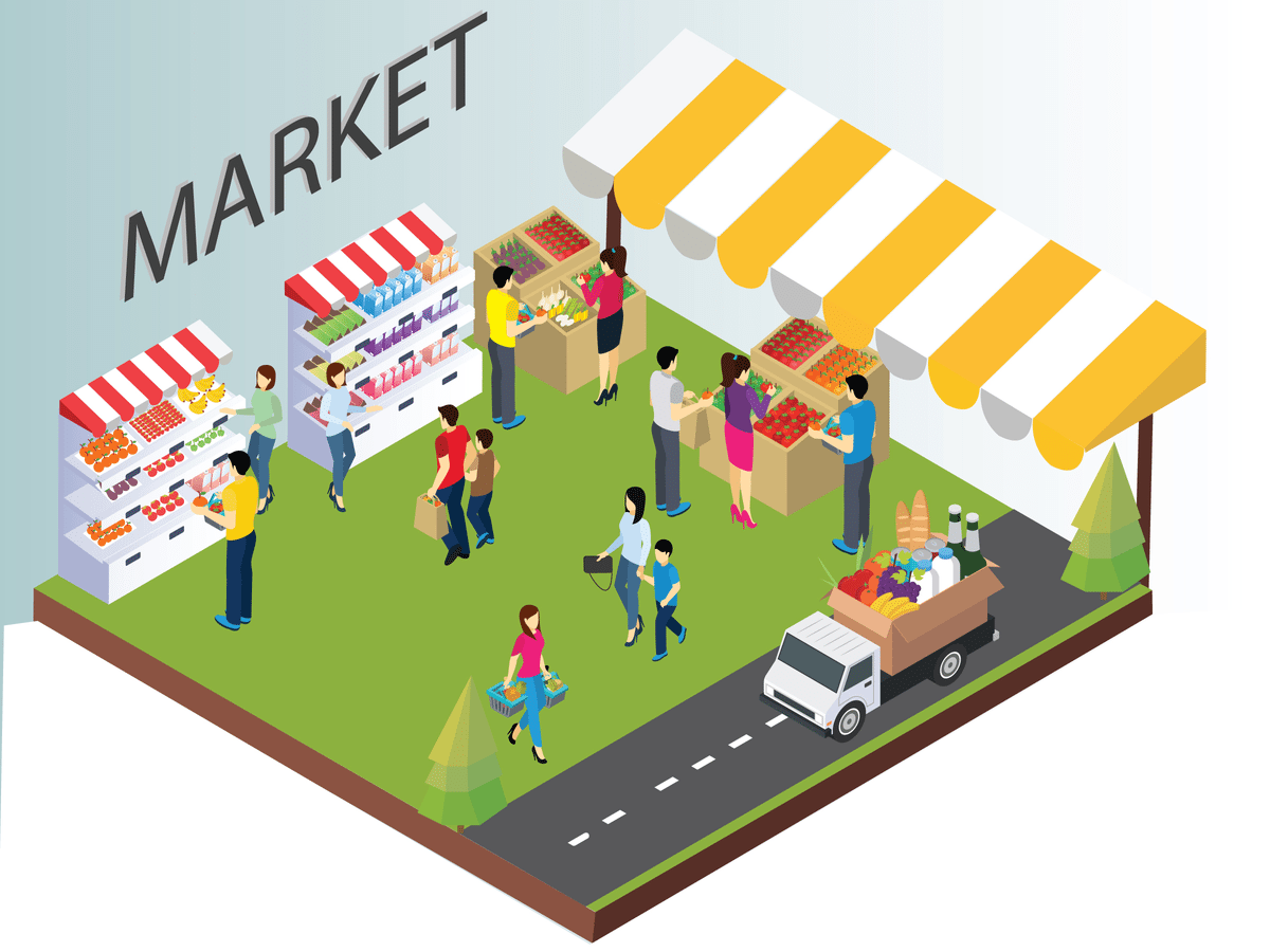
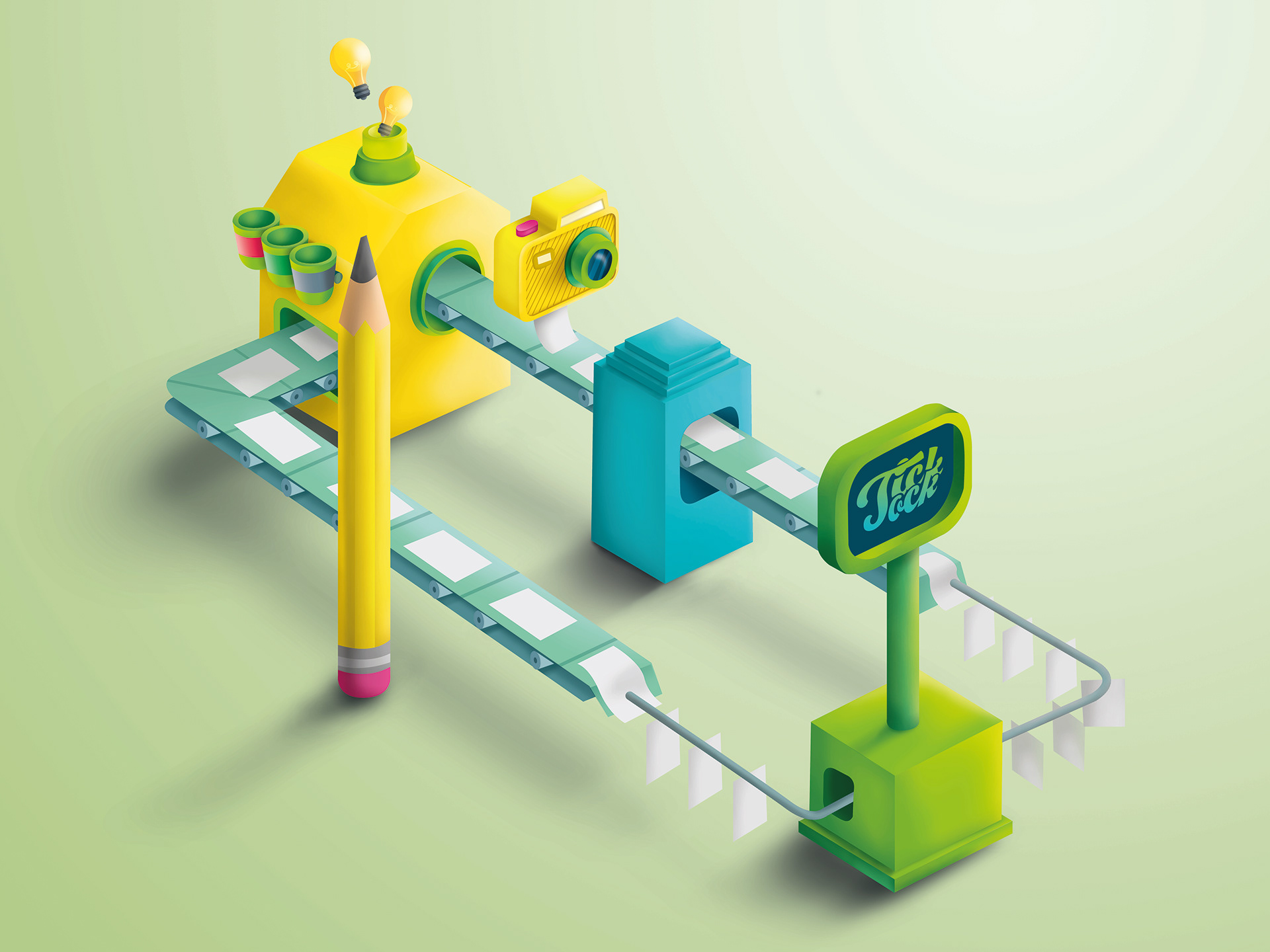
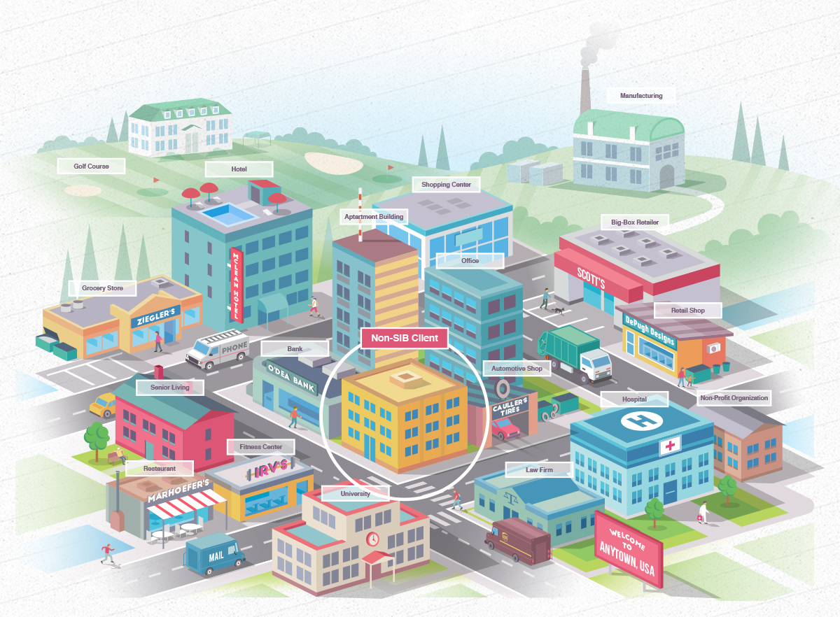
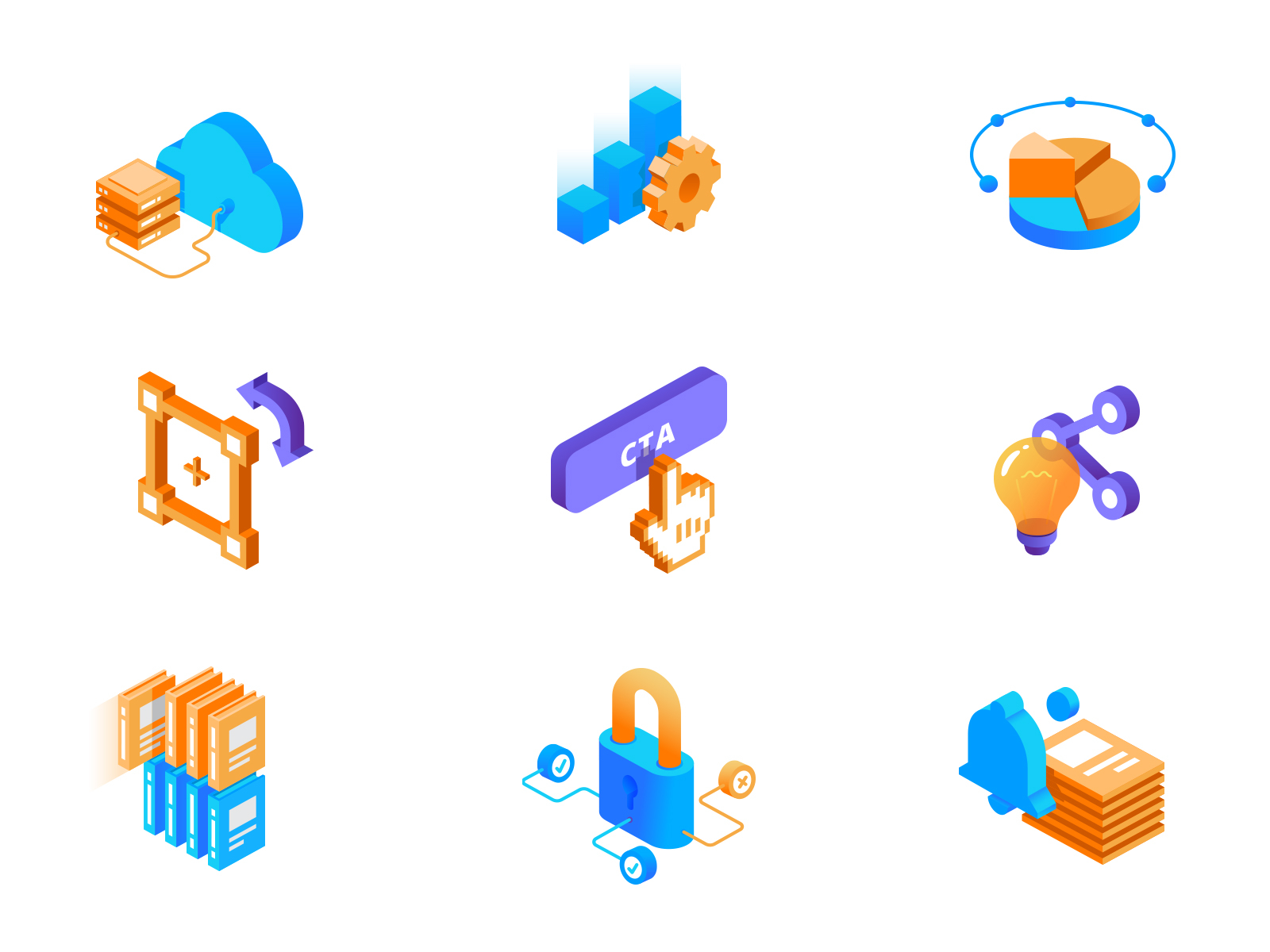
5. Isometric Design
While open compositions leave some things out, isometric designs create whole universes in tiny little spaces. Isometric design sounds highly technical, but it’s simply a method of drawing a 3D object in two dimensions. The drawing is simple and clean, but has a depth that flat design can’t compete with.
The arena where this trend is heating up the most is with icons. Isometric icons have a lot more tactility and warmth than flat design, drawing users in. Plus they are saved to a smaller file size than 3D, so you get all of the bang with none of the lag!
Mateusz Urbańczyk
Deseno
Multiple Owners
LittleFox
Anton Zaderaka
Conclusion
Did you follow the new trends? Exciting things happen when designers embrace conflict, allowing room for inspiration to strike from every direction at once. We celebrate and look forward to seeing what incredible work they create. Make 2019 the year you create your best work!
Credits to: DesignShack, RawPixel, Merehead, 99Designs, Venngage